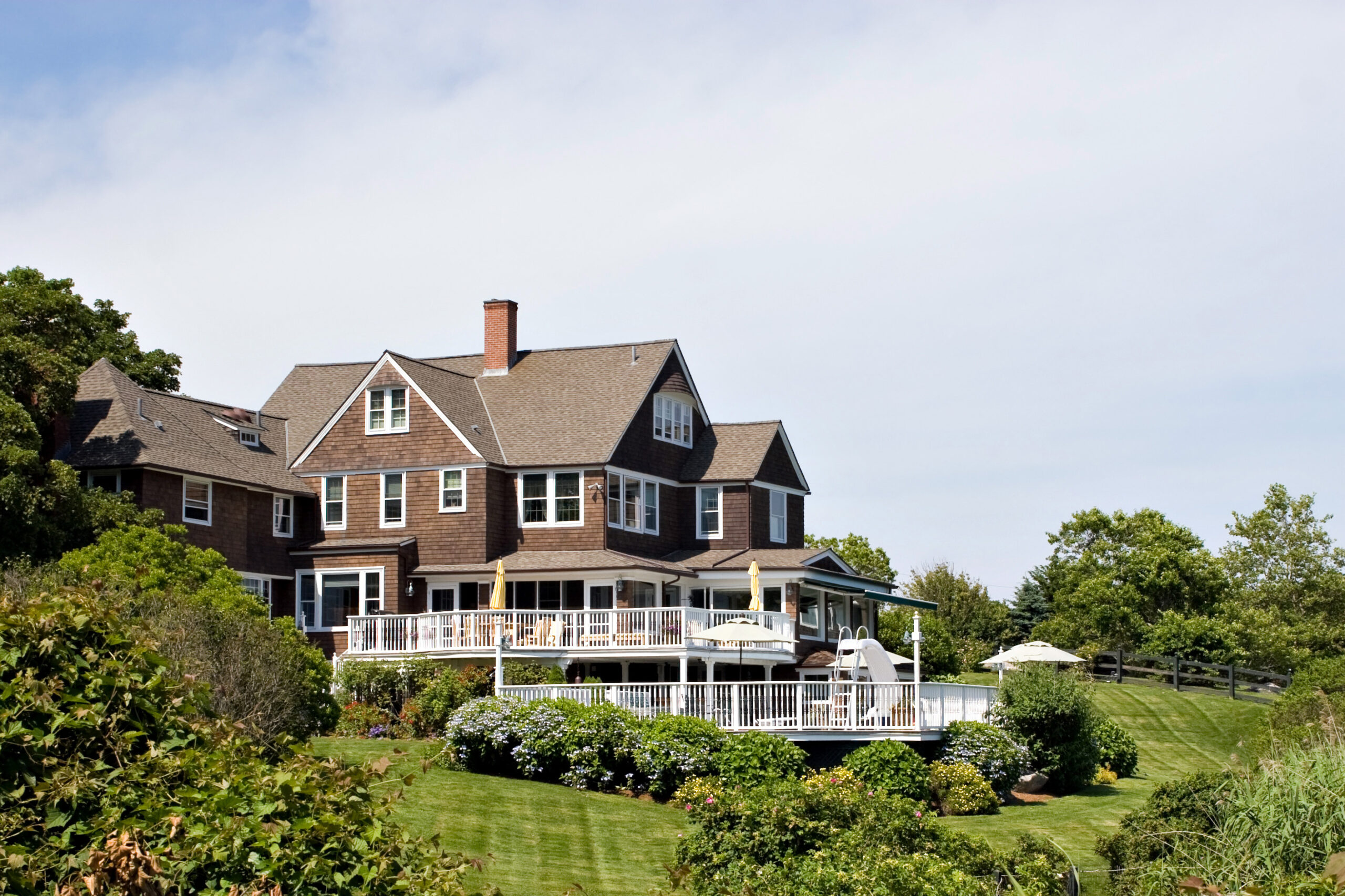

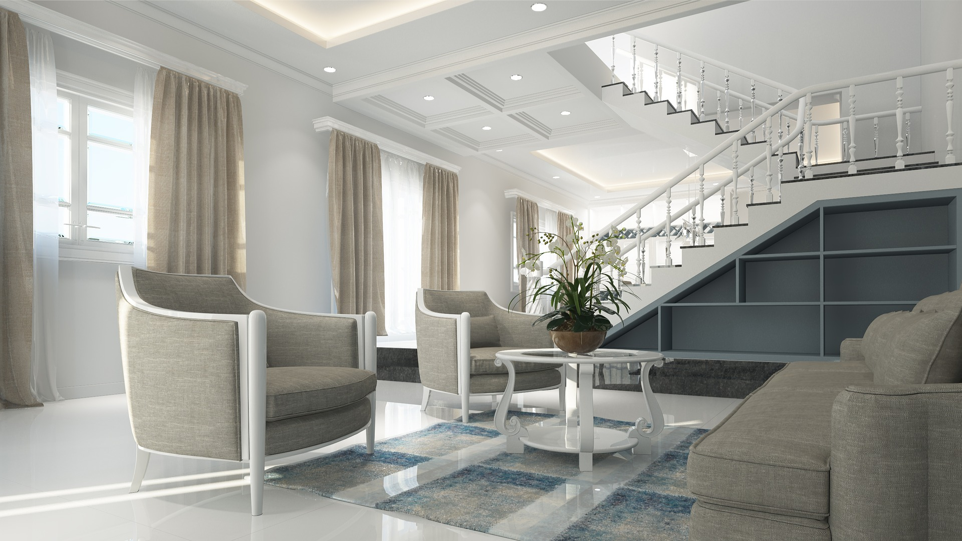
Brush Creek Lodge is Ohio’s most expensive home, valued at more than $5.9 million. Though it is difficult to ignore the house’s 30,000-acre setting, surrounded by nature and breathtaking views, the luxurious tones of brown, soft gray, and off-white breathe opulence into its interior design. Its stone exteriors emit shades of brown and other earthly tones.
Elegant interior paint colors on master bedroom walls, guest rooms, living rooms, and even smaller rooms like the study or game room can significantly impact how a space looks and feels, greatly increasing the resale value of your home. The most popular luxurious interior paint colors of today will be discussed in this article.
Our TOp Picks for Luxury Home Interior Paint Colors
Vibrant Colors Like Orange and Gold are Sensational
If used correctly, warmer colors such as orange and gold can create a luxurious atmosphere. Shades of cantaloupe orange, Osage orange, and carnival, which are associated with high energy, can create the illusion of space in smaller rooms. Cayenne orange can make a strong statement as a highlight or feature wall color.
Sunset and tangerine hues, on the other hand, make excellent secondary colors. You must instill a sense of excitement and joy in the rooms where guests will be received. Warmer colors like Aspen gold, Bungalow gold, tangerine, and cider on your living room curtains, furniture, or wall art can help create a welcoming atmosphere.
Gray Wall Color Speaks Sophistication and Eases the Hustle for Pairing
Gray is a popular interior paint color, but it must be applied softly and slowly to avoid creating a lonely and sad atmosphere in the home. Because of its compatibility with most other colors, the color is universally regarded as a canvas for color matching. For a sleek look, combine it with muted white and any other neutral wall color.
Gray looks stylish when combined with ivory and white. In addition, different shades of gray, when layered, can create a romantic feel that calms in a sophisticated way. Remember that gray reflects light, so using a subtle gray shade as your primary wall paint color makes the entire room appear brighter and more prominent, even if you don’t have a lot of natural light. Light reflects space, which is a sign of luxury.
Lighter Shades of Yellow Can Highlight Key Decorative Elements
Yellow, whether soft or bold, always attracts light and draws attention to accent walls. To create a focal point in interiors with monotones like muted white, add a classic shade of ochre and cadmium. Classic yellow is an excellent choice for the walls of your bathroom, kitchen, hallway, back porch, and other rooms in your home that do not have access to natural light. For a luxurious yet decorative look, try daisy, lemon, dusty yellow, goldenrod, and Royal Del Sol.
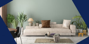
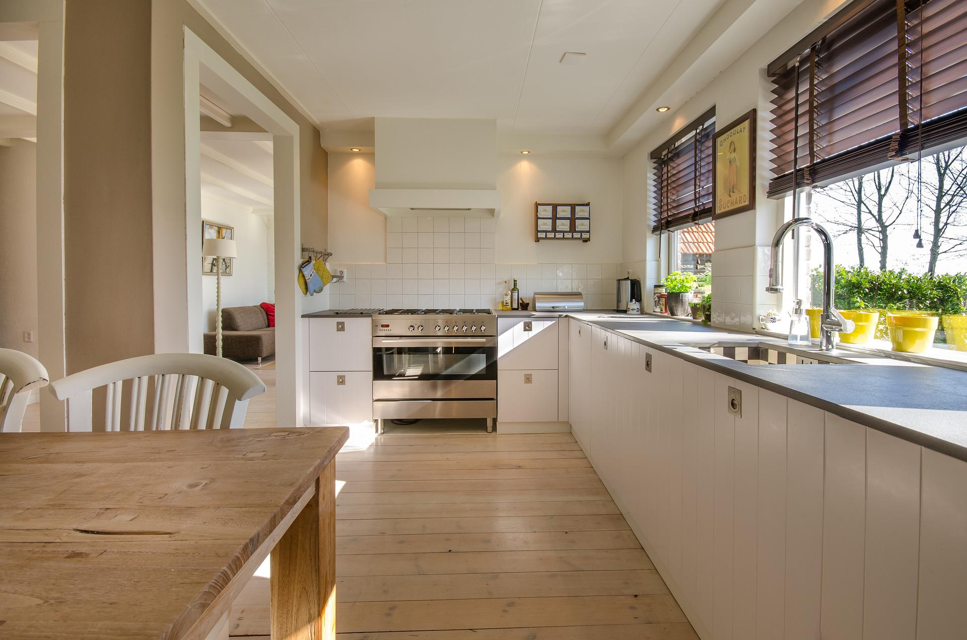
White Tones Give Spaces a Bigger and Brighter Feel
You can achieve the desired look by adding a white trim to any interior surface. White is known to reflect light away from itself, making it easier for interior designers to create the illusion of larger spaces. Try luxurious color shades like iceberg white, eggshell, white flour, white apple, white snow, or white apple for a sleek look.
For your dining room, guest room, or kitchen cabinets, give your walls, floor, hallway, ceiling, stairs, and furniture a fresh coat of Sherwin Williams Alabaster white for a luxurious, warm look. While crisp white works well as a clutter-free wall paint, it is also versatile and can be paired with other bold and neutral colors to achieve an elegant look. Being the most reflective color, avoid crisp white in rooms that already receive a lot of natural light.
Green Paint Color Oozes a Cozy and Homely Vibe
Mixing the right shades of green, which are strongly associated with nature, will give your home a whole new meaning and purpose. Olive green conveys tranquillity, whereas aqua conveys freshness. While green can evoke feelings associated with forests, grass, and the great outdoors, it is also the color of the dollar. It can create a relaxing, calming environment in the same way that green plants and nature do, but it can also elicit feelings of envy.
A stroke of green, when done correctly, gives you the green light to success, creativity, peace, safety, luck, money, and good health. To achieve this look and feel, use colors like pale green, dark green, bright green, olive green, and aqua.
Blue is Royalty & is Also Associated with Peace and a Sense of Calm
Interior designers agree that blue is uplifting, whether it’s in the sky or on the walls of our homes. To make a simple room look more elegant, use navy blue instead of black. Light blue is also calming, whereas bright blue exudes peace and friendship.
Blend different blue textures for a luxurious, peaceful, and calming atmosphere, especially in the hallway and other welcoming areas. Consider dynamic blue, deep ocean blue, or bluebell to achieve the same luxurious look in the same color.
Brown Creates a Warm & Luxurious Atmosphere
Brown is the color of the earth, and when used correctly in the interiors or exteriors of a home, it can achieve the same look as Brush Creek Lodge. You don’t have to go all out; a fresh coat of chocolate brown paint on wooden furniture, the roof, or the floor can give your home a welcoming appearance.
To avoid a dull look, pair it with a tertiary color that is warm white, soft gray, or another bold color. An experienced interior designer or painter can assist you in selecting the appropriate color palette.
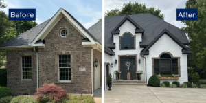
Want to Give Your Home a Luxurious Look? The Ohio Painting Company Can Help
Similarly, your expensive home can appear cheap simply because you chose the wrong color scheme. To achieve a sleek appearance, use a shade of the luxurious colors mentioned on the throw pillows, kitchen cabinets, walls, floor, or curtains. The Ohio Painting Company will assist you in creating the visual interest you seek. Give us your favorite colors and let us transform your home into something new and luxurious. For a free consultation, call (937) 409-4443.